Visual identity redesign
Client
Deliverables
Context
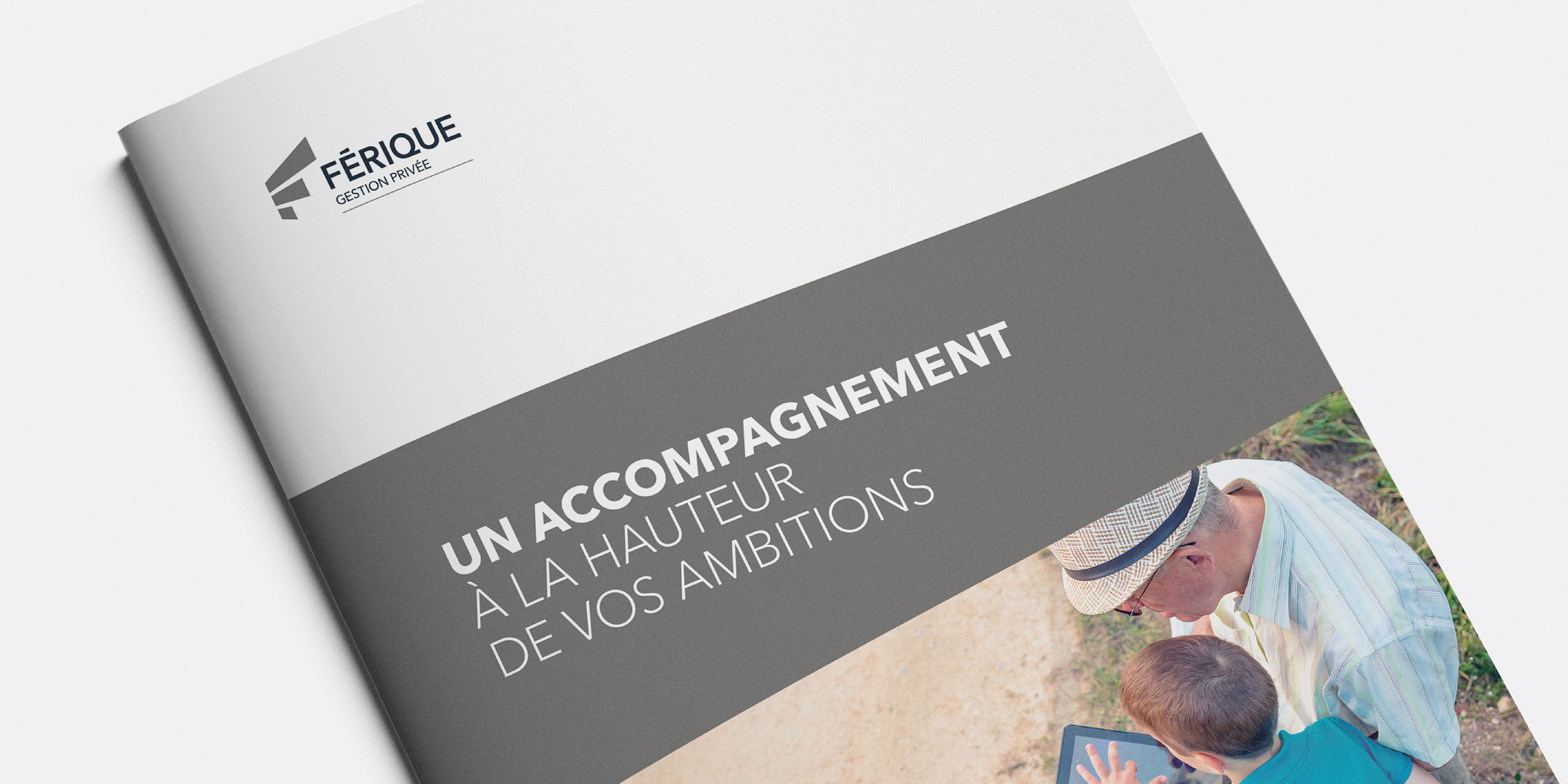
FÉRIQUE (Fonds d’épargne et de retraite des ingénieurs du Québec) Fund Management wanted a unique visual identity to represent the company and help it stand out in a highly competitive market. The biggest challenges were to unite the various parts of the organization and design a new graphic template suitable for all of its different products.
Process
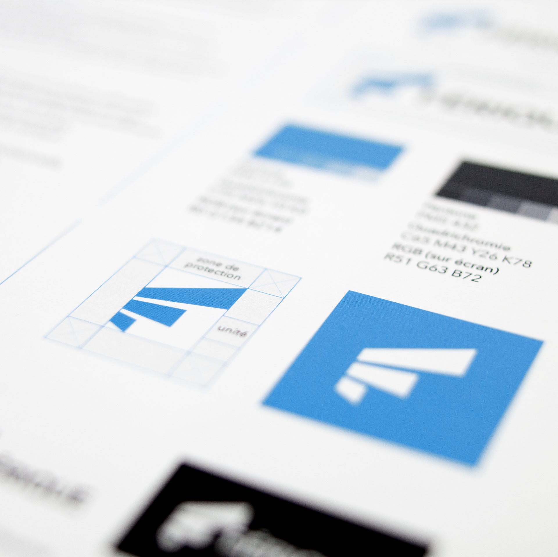
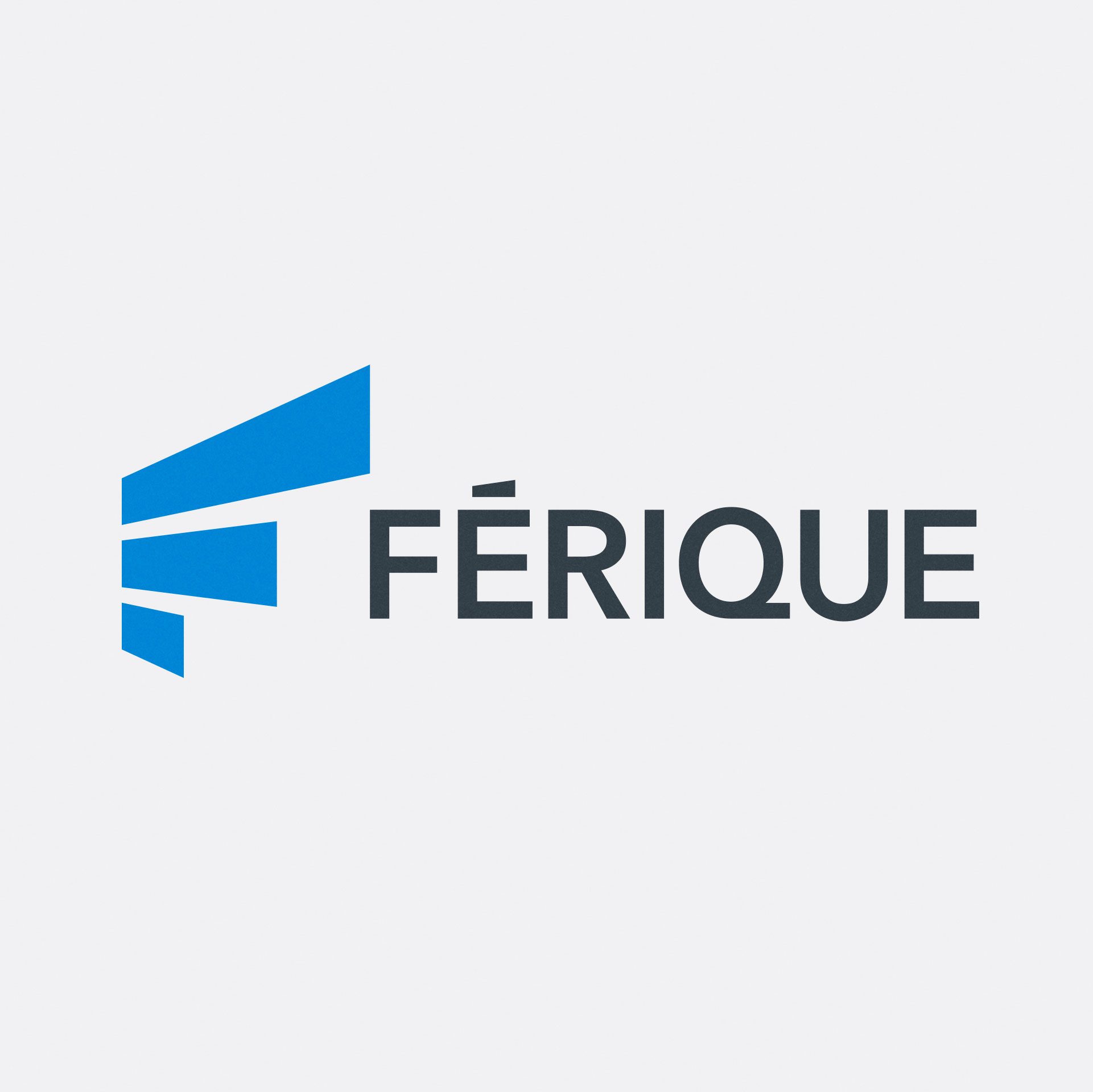
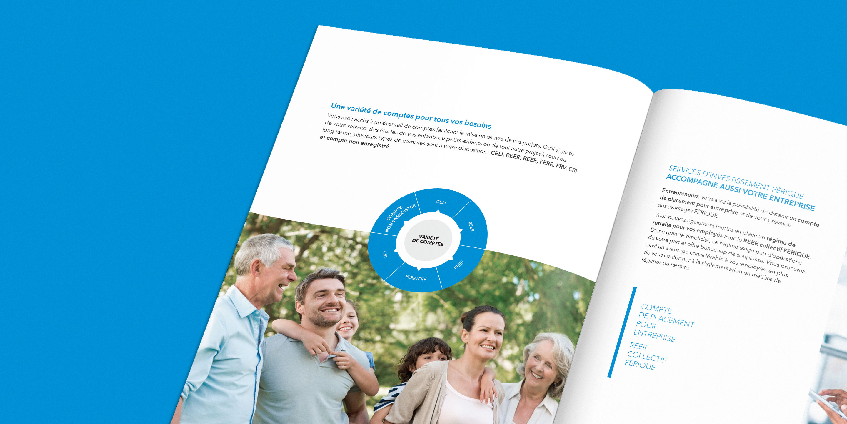
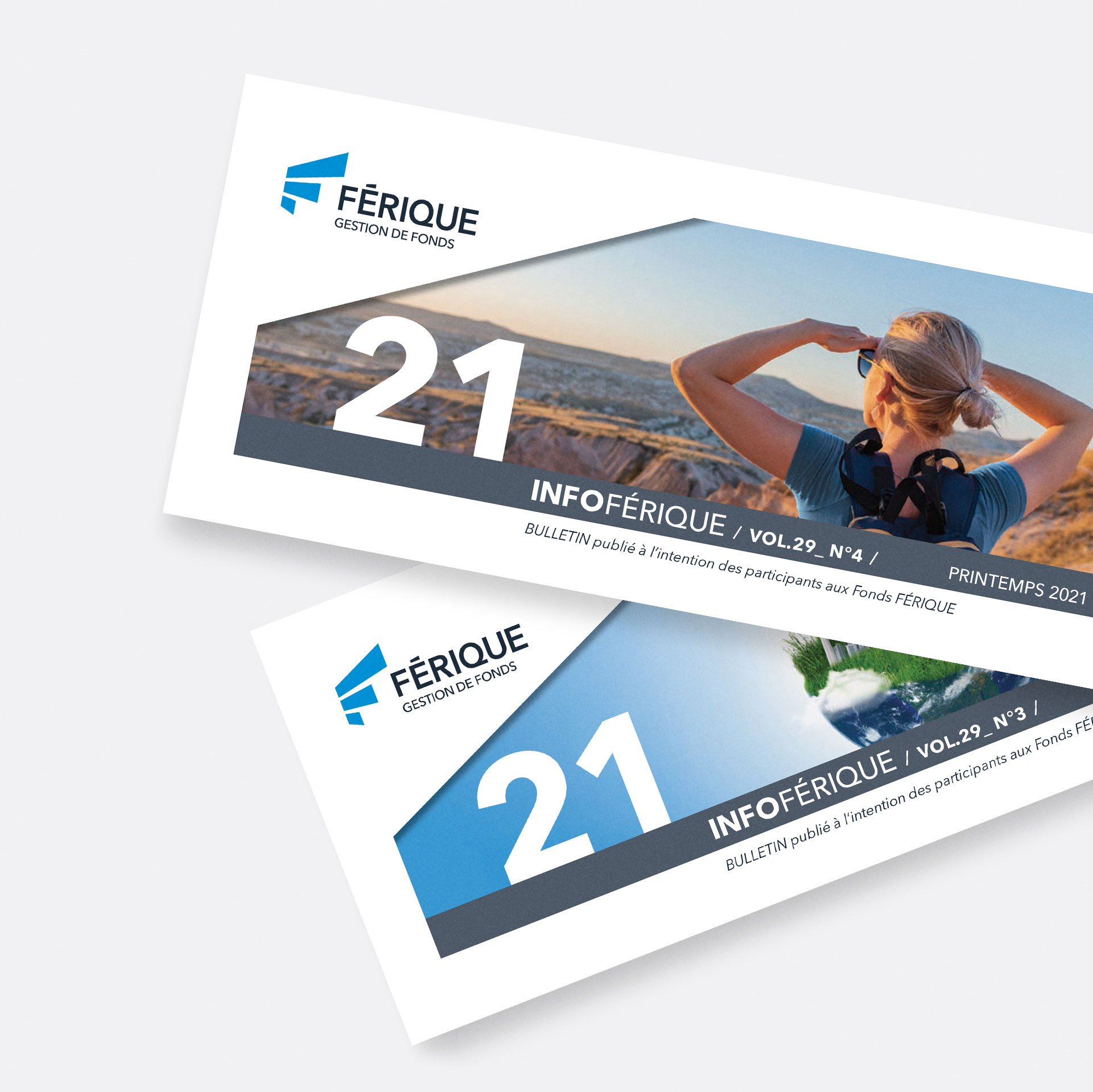
Inspired by the themes of direction and growth, Dyade designed a monogram of rising shapes, evoking a springboard toward performance. The graphic template for the FÉRIQUE brand was based on the logo’s diagonal lines, the company’s official colours and the concepts of integrity and transparency. Dyade also developed specifications for photos and a secondary colour palette as part of the graphic standards. To ensure a consistent aesthetic, FÉRIQUE Private Wealth’s and FÉRIQUE Funds publications followed the guidelines for the main brand.
Result
An evocative, unifying logo that stands out. A brand image that embodies and bolsters the FÉRIQUE personality. Stationery, a standards guide, sales materials, a newsletter and promotional items that inspire confidence and convey a sense of rigour.