Revamping the O’select care line
Client
Deliverables
Context
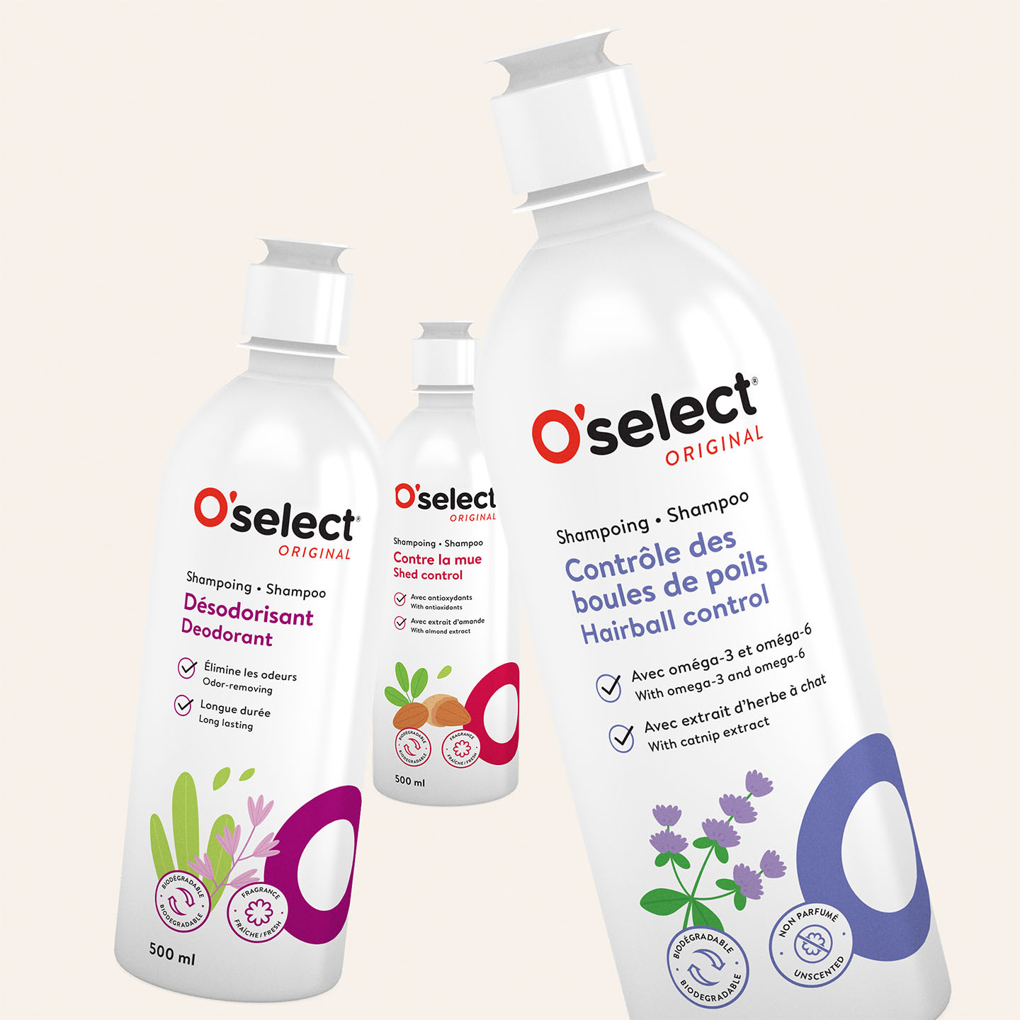
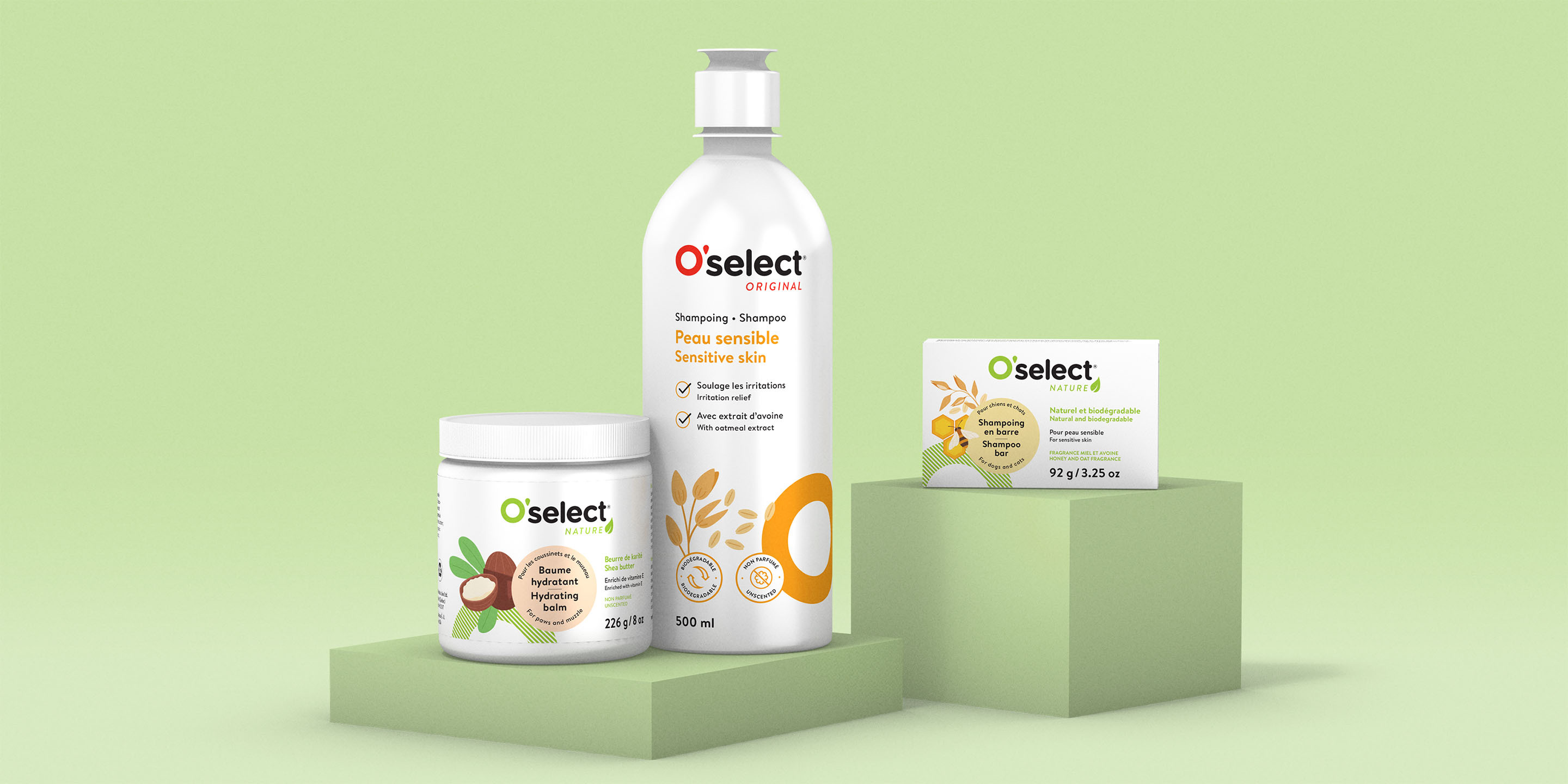
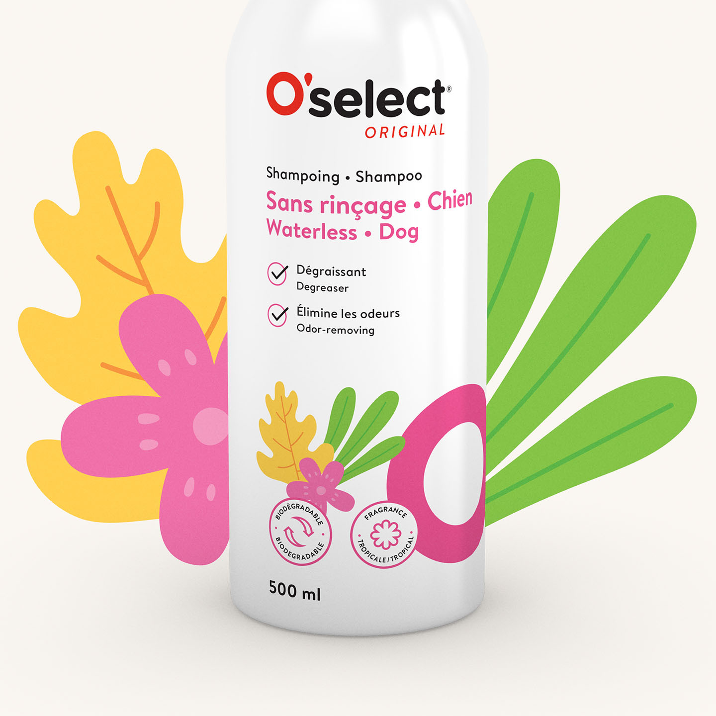
Having recently worked with us to redesign the O’select brand image and launch its hygiene and cleanliness products, Mondou tasked Dyade with updating and further developing its care line. Dyade’s challenge was to present a new brand image while maintaining a style that would be easy to recognize and appealing to a young clientele.
Process
Dyade designed sleek illustrations where the O, the line’s emblematic symbol that sets it apart on the shelves, varies in colour to help customers quickly differentiate between the product types and compare their features. The structure of the information was reworked using a colour code and icons on the packaging to clearly indicate the benefits and features of each product.

Result
Attractive packaging and information on the ingredients’ freshness that create a visual link between these products and the O’select hygiene and cleanliness line also designed by Dyade.